Opt-In Forms - Where to Put Them, What to Write and How to Get More Sign-Ups (2026)
What Is an Opt-In Form?
An opt-in form is a form where visitors give permission to join your email list, usually by entering their email address. It might sit inside a blog post, pop up after someone has read for a while, appear as a bar at the top of a page or be the main element of a landing page.
Opt-in forms are the entry point of your email marketing. Every subscriber, lead and future customer from email starts by filling one in. That's why small improvements to your forms, such as a clearer promise or one fewer field, can noticeably change how fast your list grows.
What it means for you: you don't need many forms, but you need the right ones in the right places, each with a clear reason to subscribe.
A clear offer, the right placement and as few fields as possible
Use a dedicated landing page plus one or two on-site forms, offer a specific freebie, ask only for an email address and make the button say what happens next.
Types of Opt-In Forms
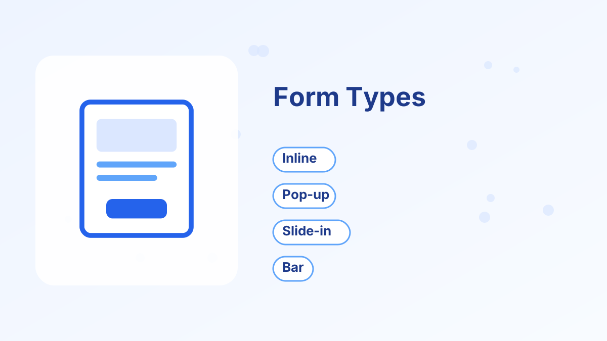
| Form type | Where it appears | Strength | Watch out for |
|---|---|---|---|
| Inline form | Inside page content, often after a post | Non-intrusive, relevant to the content | Easy to miss if placed low on the page |
| Pop-up | Over the page, after a delay, scroll or exit intent | Highly visible | Can annoy visitors if shown too early or too often |
| Slide-in | Slides into a corner after scrolling | Visible but less disruptive | Small space for copy |
| Floating bar | A thin bar at the top or bottom | Always visible, simple | Limited room to explain the offer |
| Landing page | A dedicated page with one form | Focused, converts well from links | Needs traffic sent to it |
| Content upgrade | Inside a specific post, offering a related bonus | Very relevant, often converts well | Takes extra work per post |
Most sites do well with a combination of two or three: a landing page you share everywhere, an inline form after relevant content and perhaps one carefully timed pop-up or slide-in.
Where to Place Opt-In Forms
Place forms where visitors are most interested. On a blog, that's usually within or after articles, where readers have just received value. A content upgrade inside a post, offering a related checklist or template, is often the most relevant form you can show.
On your homepage, a short form near the top with a specific offer works well. On your about page, readers who want to know you better are often happy to subscribe. And everywhere you have a profile, from social media bios to your email signature, link to your landing page.
Avoid putting a form in a place nobody sees, such as only at the very bottom of the footer.
What to Write on an Opt-In Form
The copy matters more than the design. A strong opt-in form answers three questions in seconds: what will I get, why is it useful and what do I do now?
- HeadlineName the specific benefit: "Get the 7-Day Budget Reset Checklist."
- One supporting lineExplain who it's for or what's inside.
- FieldEmail address only, or first name and email.
- Button textSay what happens: "Send Me the Checklist" rather than "Submit."
- ReassuranceA short line about what you'll send and that they can unsubscribe anytime.
Avoid generic offers like "Subscribe to our newsletter." People join for a clear benefit, not for more email.
How Many Fields Should a Form Have?
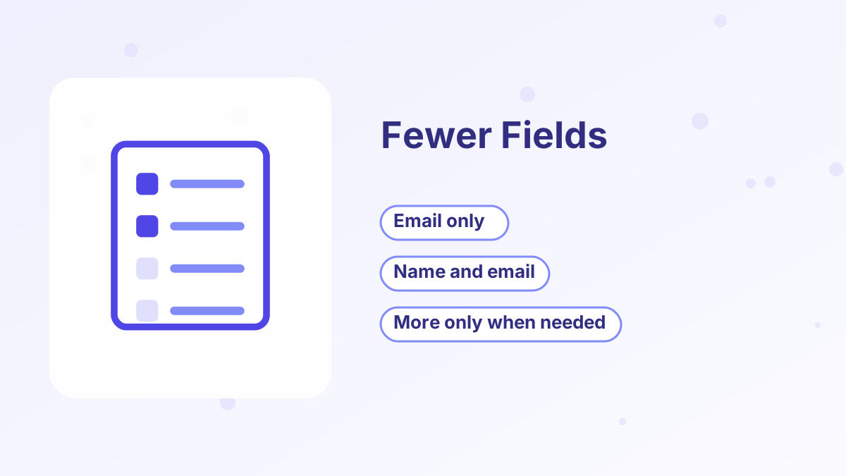
Every extra field asks for more effort and gives some visitors a reason to quit. For most lead magnets and newsletters, an email address alone or a first name and email is the right choice.
Ask for more only when you'll use it. If you want to segment subscribers, consider letting them choose between two freebies, or ask one question after they subscribe, such as on the thank-you page. That keeps the form short while still learning about your audience. See email list segmentation.
Pop-Up Best Practices
Pop-ups can grow lists quickly, but they need care. Show them after visitors have engaged, such as after scrolling part of a page, spending some time on the site or showing exit intent, rather than the instant the page loads.
Limit how often they appear, so returning visitors aren't shown the same pop-up every time. Make the close button easy to find, and keep the copy short. On mobile, use small, easy-to-dismiss formats, because large interstitials that cover content can frustrate visitors and may be treated poorly by search engines.
Single vs Double Opt-In
With single opt-in, people join immediately after submitting the form. With double opt-in, they receive an email asking them to confirm first.
Single Opt-In
- More subscribers, because there's no confirmation step
- Faster delivery of the lead magnet
- Simpler for subscribers
Double Opt-In
- Confirms genuine, correctly typed addresses
- Reduces bot and fake sign-ups
- Can help deliverability for lists with quality issues
Many small businesses start with single opt-in and switch to double opt-in if they see many bounces or fake sign-ups. Some countries have rules about consent, so check what applies to your audience. See email deliverability tips.
Connecting Forms to Your Email Sequences
A form is only the beginning. Make sure every form adds subscribers to the right list, applies a tag that shows which offer they chose and starts the matching welcome sequence. Test each form by subscribing yourself.
In systeme.io, opt-in forms on funnel pages and pop-ups can add tags and trigger automation rules, so each new subscriber receives the right lead magnet and welcome emails automatically. The free plan includes this with 2,000 contacts and unlimited sends. See welcome email sequence and systeme.io automation rules.
Testing and Improving Your Forms
Track each form's conversion rate: sign-ups divided by the visitors who saw it. Compare forms over time, and test one change at a time. The offer and headline usually have the biggest impact, followed by placement, button text and timing for pop-ups.
If a form performs poorly, ask whether the offer matches the page it's on. A form offering a recipe planner on an article about budgeting will struggle, however well it's designed. See improve funnel conversion rate.
Add Opt-In Forms That Tag and Follow Up
Forms, pop-ups, tags and welcome emails connected on systeme.io, free to start.
Try Systeme.io FreeOpt-In Forms FAQs
What is an opt-in form?
A form where visitors give permission to join your email list, usually by entering their email address in exchange for something useful.
Which type of opt-in form works best?
It depends on placement and offer. Many sites combine a landing page, an inline form after relevant content and one well-timed pop-up.
How many fields should an opt-in form have?
Usually one or two: email address, or first name and email.
Are pop-ups annoying?
They can be if shown too early or too often. Time them after engagement, limit frequency and make them easy to close.
Should you use double opt-in?
Use it if you see many fake or mistyped addresses, or if rules in your audience's country call for it.